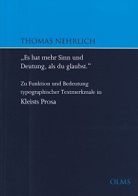
The Sense Lies in the Detail. Nehrlich's Study about Typographic Features in Kleist's Prose
DOI:
https://doi.org/10.22029/ko.2014.825Abstract
Nehrlich’s survey Zu Funktion und Bedeutung typographischer Textmerkmale in Kleists Prosa provides an important contribution to the research of Kleist as well as interesting new aspects of the current studies of notational iconicity focusing on materiality and visibility of writing. Typographical features like black letter, letter-spacing, ligature, and punctuation in the authorized release of Kleist’s Erzählungen (1810/11) are the initial points of Nehrlich’s analysis. He states convincing new results and proffers a differentiated impression of scripture-understanding during Kleist’s time. His connections of interpretation and edition draw attention to the face of historical printed texts and typographically guided reading processes.
References

Downloads
Published
Issue
Section
License
All articles (not book covers) in KULT_online from issue 50 on are published under the license Creative Commons Attribution 4.0. All published articles may be reused under the conditions of the license, particularly for commercial purposes and through editing the article (Human-Readable Summary). All authors (have) permitted the publication under the above mentioned license. There is no copyright transfer towards KULT_online. For all book covers specific rights might be reserved, please contact the respective publisher for any lawful reuse. All contributions published in issue 1-49 of KULT_online are free available online and protected by the German Copyright Law.


